Update: January 16, 2018. Updated the post to include the data from FSA and FSAdata packages.
In our work, presenting the status of fish stocks is very important. It can help local fishers as well as Local Government Units (LGUs) in crafting an ordinance or measures to manage the fish stocks in their respective jurisdictions. The data cannot tell the real status unless it has a visual form, such as a graph or chart.
One of the graphs produced by my colleagues is based on the length-frequency distribution data. They used Microsoft Excel to create the graph, and manually drew rectangles inside the plot to differentiate the lengths of immature, mature, and mega-spawner fish of a single species.
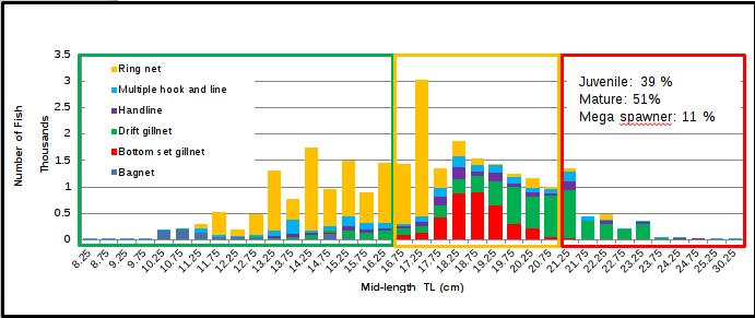
Above is an example of the plot, but it is stacked according to the fishing gear used to catch that particular species (not shown).
I find this tiring, especially in the context of reproducibility. If there are any changes to the raw data, they would have to perform a series of pivoting operations and manually produce the graph.
Therefore, I tried to recreate the graph, with a few modifications, using R and the ggplot2 package.
In this tutorial, I wanted to produce a histogram of length frequency using the ggplot2 package in R. If you are new to ggplot2, there are many free online resources available to you.
Preliminary Steps
To follow this tutorial, you will need to install the following packages.
install.packages("ggplot2")
install.packages("dplyr")
install.packages("magrittr")
To further customize the appearance of your graphs, you can install the ggthemes package.
install.packages("ggthemes")
Once installed, you can load it by typing:
library(ggplot2)
library(dplyr)
library(magrittr)
library(ggthemes)
The Data
I used the CiscoTL data from the FSAdata repository. The meta-documentation for this data can be found here. I saved the data into a CSV file, which you can download here.
head(cisco_data)
##       V1 lakeid year4 sampledate gearid spname length weight    sex
##    <int> <char> <int>     <char> <char> <char>  <int>  <num> <char>
## 1:     1     TR  1981  8/11/1981 VGN032  CISCO    140   21.4      F
## 2:     2     TR  1981  8/10/1981 VGN032  CISCO    146   22.3      F
## 3:     3     TR  1981  8/11/1981 VGN032  CISCO    147   23.3      F
## 4:     4     TR  1981  8/19/1981 VGN032  CISCO    153   23.5      F
## 5:     5     TR  1981  8/19/1981 VGN032  CISCO    150   24.0      F
## 6:     6     TR  1981  8/19/1981 VGN032  CISCO    152   24.0      F
The Process
A histogram is a type of graph that shows the distribution of data. It is similar to a bar chart, but it is used to display continuous data, such as length measurements. Histograms are made up of bins, which are ranges of data values. To find the appropriate bins for your data, you must first find the class size and class interval.
You can compute for the class interval by using the formula:
\(Class Interval = (Range / Class Size)\)
To find the range of your data, first find the highest value and subtract the lowest value. In our data, the range can be computed as:
cisco_data_range <- max(cisco_data$length) - min(cisco_data$length)
The range of the data is 322. Next, we need to specify the class size. There is no set rule for determining the number of classes, but it is up to the researcher to choose a number that is large enough to show the distribution of the data.
class_size <- 20
Say, for example, you settled in a class size of 20, then finding the class interval is simply dividing the range with the class size.
class_interval <- cisco_data_range / class_size
The next step is to find the lower and the upper limits of the bins.
lower_limit <- seq(min(cisco_data$length), max(cisco_data$length), by = class_interval)
The code above creates a sequence of numbers starting from the minimum value and ending at the maximum value, with an interval of 16.1. The class interval is the distance between each number in the sequence. To find the upper limit of a bin, we add the class interval to the lower limit of the bin and subtract 0.1.
upper_limit <- (lower_limit + class_interval) - 0.1
To use a function on a set of values, we must first convert the values to a data frame. A data frame is a table-like structure that stores data in rows and columns. This makes it easier for functions to operate on the data.
df_bin <- as.data.frame(cbind(lower_limit, upper_limit))
Now that the data is in a data frame, we can calculate the mid-lengths of the class bins. We can do this by creating a new column in the data frame using the mutate() function in the dplyr package.
df_bin <- df_bin %>%
  mutate(midlength = (lower_limit + upper_limit) / 2)
By placing the limits of the class intervals midway between two numbers, we can ensure that every score will fall within an interval, rather than on the boundary between intervals. This is important because it allows us to accurately calculate the frequency of each interval.
Note: We used a class size of 20 in our computation, but this resulted in 21 intervals.
nrow(df_bin)
## [1] 21
Now that we have calculated the general values, we need to find the specific values for this species. When presenting a length frequency distribution in the form of a histogram, it is common practice to add a vertical line representing the length-at-first maturity ($L_m$) of the species. The value for \(L_{m}\) can be found on FishBase.
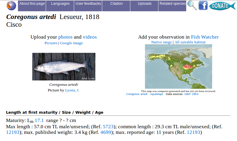
On FishBase, search for “Coregonus artedii”. The value for length-at-first maturity is 17.1 cm.
cisco_lm_cm <- 17.1
Convert the \(L_{m}\) value to millimeters:
cisco_lm_mm <- cisco_lm_cm * 10
In addition to the \(L_{m}\) line, another vertical line is added to the graph to represent the starting length of the mega-spawner. I asked my colleagues how to calculate this, and they told me that it can be done by multiplying the maximum recorded length for that species by \(0.7\). I have not yet found the reference for this calculation.
cisco_mega <- (max(cisco_data$length)) * 0.7
The values are now calculated and ready. We can now create the graph. First, let’s create a variable to store the title of our graph.
my_title <- expression(paste("Length frequency distribution of Cisco (", italic("Coregonus artedi"), ")"))
Custom theme
I found a custom ggplot2 theme online and made a few minor changes to it to better suit my needs. The original theme can be found here.
theme_pub <- function(base_size = 14, base_family = "Liberation Serif") {
  library(grid)
  library(ggthemes)
  (theme_foundation(base_size = base_size, base_family = base_family)
    + theme(plot.title = element_text(face = "bold",
                                      size = rel(1.2),
                                      margin = margin(b = 0)),
            text = element_text(),
            panel.background = element_rect(colour = NA),
            plot.background = element_rect(colour = NA),
            plot.subtitle = element_text(margin = margin(t = 5, b = 10)),
            panel.border = element_rect(colour = NA),
            axis.title = element_text(face = "bold", size = rel(1)),
            axis.title.y = element_text(angle = 90, vjust = 2),
            axis.title.x = element_text(vjust = -0.2),
            axis.text.y = element_text(),
            axis.text.x = element_text(size = 10, angle = 25),
            axis.line = element_line(colour = "black"),
            axis.ticks = element_line(),
            panel.grid.major = element_line(colour = "#f0f0f0"),
            panel.grid.minor = element_blank(),
            legend.key = element_rect(colour = NA),
            legend.position = "bottom",
            legend.direction = "horizontal",
            legend.key.size = unit(0.2, "cm"),
            legend.title = element_text(face = "italic"),
            legend.text = element_text(size = rel(1)),
            plot.margin = unit(c(10,5,5,5), "mm"),
            strip.background = element_rect(colour = "#f0f0f0", fill = "#f0f0f0"),
            strip.text = element_text(face = "bold")
    ))

}
To change the font used in ggplot2 plots, you can set the base_family parameter to the name of the font you want to use.
You can save this code as a separate R script, such as custom-theme.R. Then, in your document, you can source the script by using the following code:
source("scripts/custom-theme.R")
Plotting
We will build the graph step by step. First, let’s take a look at the basic histogram in ggplot2.
plot1 <- ggplot(data = cisco_data, aes(x = length)) +
  geom_histogram()

print(plot1)
The basic histogram uses 30 bins by default, as you can see from the message that appears after you run the print() function on plot1. To use our computed value, we need to assign it to the binwidth option in the geom_histogram function.
plot2 <- ggplot(data = cisco_data, aes(x = length)) +
  geom_histogram(binwidth = class_interval)

print(plot2)
Another way to create a histogram is to use the bins option instead of the binwidth option. However, the value you specify for the bins option must be the same as the actual class size. In our case, the actual class size is 21, so we would use the following code:
plot3 <- ggplot(data = cisco_data, aes(x = length)) +
  geom_histogram(bins = class_size + 1)

print(plot3)
I added 1 to the class_size variable to make it 21. As you can see, the plots generated are the same. However, if you plot it using just the class_size variable in the bins option, the generated plot will be different. Try it to see.
Also, note that the numbers on the x-axis range from 100 to 400, with an interval of 100. If you want to use the midpoints as the numbers on the x-axis, we can use the breaks option. This must be supplied to the argument scale_x_continuous.
plot4 <- ggplot(data = cisco_data, aes(x = length)) +
  geom_histogram(binwidth = class_interval) +
  scale_x_continuous(breaks = df_bin$midlength)

print(plot4)
Now that we have the code for our basic histogram, we can customize it to meet our requirements. To begin, we’ll change the color of our graph. To do so, simply add the fill argument to the geom_histogram function. You can use a color name or its HEX value. If you also want to change the color of the border of each bar, you can add the color argument.
plot5 <- ggplot(data = cisco_data, aes(x = length)) +
  geom_histogram(binwidth = class_interval, fill = "gray", color = "black") +
  scale_x_continuous(breaks = df_bin$midlength)

print(plot5)
Now, we will add the title we created and change the axis labels. In this section, we will recycle the plot5 code so that we do not have to type it over and over again.
plot6 <- plot5 +
  labs(title = my_title,
        subtitle = "The samples were taken from Trout Lake, WI, 1981-2006.",
        x = "Midlength (mm)",
        y = "Frequency",
        caption = "(Based on the data from fishR website by Derek Ogle)")

print(plot6)
The labs() function is straightforward. It includes the title and axis labels. You can also add a caption below the graph using the caption argument.
Starting here, we will reuse the code from the previous plots to generate the final histogram. Now, we will add a vertical line to indicate the location of the length-at-first maturity of the species.
plot7 <- plot6 +
  geom_vline(aes(xintercept = cisco_lm_mm), color = "red",
            linetype = "dashed", size = 0.5)

print(plot7)
Add an arrow to indicate that the line is at the length-at-first maturity. Since the red line is at 171 mm, the pointed end of the arrow should be at 172 mm (xend). The tail end of the arrow (x) should extend from xend and to the right. y and yend should be the same for a straight arrow.
plot8 <- plot7 +
  geom_segment(aes(x = 220, y = 2100, xend = 172, yend = 2100),
              arrow = arrow(length = unit(0.2, "cm")))

print(plot8)
Add a label next to the arrow.
plot9 <- plot8 +
  annotate("text", x = 300, y = 2100, label = "Length-at-first maturity (171 mm)")

print(plot9)
Add a rectangle to enclose the lengths that are below the length-at-first maturity. xmin must be set to -Inf to cover the entire area to the left of the red vertical line. xmax should be set to a value just below the length-at-first maturity. ymax must be set to Inf to cover the height of the chart since we do not know the actual value of the maximum value on the y-axis, as it is automatically calculated by geom_histogram.
plot10 <- plot9 +
  annotate("rect", xmin = -Inf, xmax = 170, ymin = 0, ymax = Inf,
            alpha = 0.2)

print(plot10)
To add text inside the rectangle area indicating that the lengths are immature or juveniles, you will need to adjust the values in the x and y options. The x option controls the horizontal position of the text, and the y option controls the vertical position of the text. You can adjust these values until the text is positioned correctly inside the rectangle area.
plot11 <- plot10 +
  annotate("text", x = 97, y = 1700, label = "Juveniles/\nImmature")

print(plot11)
The \n code is a newline character that is used to create a line break in text. To add text indicating that the lengths after the red line are mature, you can use the following code:
plot12 <- plot11 +
  annotate("text", x = 230, y = 1700, label = "Mature")

print(plot12)
To add another rectangle to indicate that the lengths beginning at 276.5 mm are mega spawners, you will need to set the xmax and ymax values to Inf. The xmax value controls the horizontal position of the right edge of the rectangle, and the ymax value controls the vertical position of the bottom edge of the rectangle. By setting these values to Inf, you are telling ggplot2 to extend the rectangle to infinity in both directions.
plot13 <- plot12 +
  annotate("rect", xmin = 276.5, xmax = Inf, ymin = 0, ymax = Inf,
            alpha = 0.2)

print(plot13)
To add a text inside the rectangle indicating that the said lengths are mega-spawners, you will need to use the following code:
plot14 <- plot13 +
  annotate("text", x = 350, y = 1700, label = "Mega Spawner")

print(plot14)
To complete the graph, apply the custom theme. The histogram below shows the final results.
plot15 <- plot14 +
  theme_pub()

print(plot15)
We can now save the completed graph as a Tagged Image File Format (TIFF) image.
tiff("histogram-cisco.tif",
      res = 600, compression = "lzw", height = 5, width = 9, units = "in")
print(plot15)
invisible(dev.off())
Complete code
histogram_cisco <- ggplot(data = cisco_data, aes(x = length)) +
  geom_histogram(binwidth = class_interval, fill = "gray", color = "black") +
  scale_x_continuous(breaks = df_bin$midlength) +
  labs(title = my_title,
        subtitle = "The samples were taken from Trout Lake, WI, 1981-2006.",
        x = "Midlength (mm)",
        y = "Frequency",
        caption = "(Based on the data from fishR website by Derek Ogle)") +
  geom_vline(aes(xintercept = cisco_lm_mm), color = "red",
              linetype = "dashed", size = 0.5) +
  geom_segment(aes(x = 220, y = 2100, xend = 172, yend = 2100),
              arrow = arrow(length = unit(0.2, "cm"))) +
  annotate("text", x = 300, y = 2100, label = "Length-at-first maturity (171 mm)") +
  annotate("rect", xmin = -Inf, xmax = 170, ymin = 0, ymax = Inf,
            alpha = 0.2) +
  annotate("text", x = 97, y = 1700, label = "Juveniles/\nImmature") +
  annotate("text", x = 230, y = 1700, label = "Mature") +
  annotate("rect", xmin = 276.5, xmax = Inf, ymin = 0, ymax = Inf,
            alpha = 0.2) +
  annotate("text", x = 350, y = 1700, label = "Mega Spawner") +
  theme_pub()
I hope you enjoy following the tutorial. Please note that you may need to adjust and re-run the codes several times to produce your desired graph. This is also true for the custom theme.